
.webp)
Strategic Planning
User Interview
UX Design
UI Design
User Testing
Travel
FinTech
Multi-currency wallet
YouTrip is a multi-currency mobile wallet with a prepaid Mastercard® that offers zero transaction fees across 150+ currencies at wholesale exchange rates and also allows for the exchange and storage of 10 selected currencies.To celebrate YouTrip’s 3rd anniversary, we are bringing app 2.0 with new features and enhanced experience to the users and prepare for travel to resume. I was assigned to work on the Onboarding as it’s crucial for acquiring new users.
.webp)
The technical issue such as unable to login with Email, length sign up with no sense of progress, ID scanning issues and long physical card delivery time leads to abandon sign up and high user acquisition cost
.jpg)
K.I.S.S
we aim to make the onboarding process as simple and self explanatory as it can to minimise the friction and CS enquiries
Quick
We aim to shorten the sign up process to 3 minutes by removing/combining the unnecessary steps
Transparent
Users should have a sense of where they are in the application processand how much longer it needs to complete
Interactive
The form filling process is dull. Providing an interactive experience is the direction we set to make user feels like it is applying with a real service agent
New KYC Service Provider
Approve MyInfo application (~90% user) as quick as 5s
Virtual Card
Users no longer need to wait for the physical card to arrive in order to start using YouTrip and it also reduce a big portion of our CS enquiries relate to Card Delivery
I started exploring different designs and gather feedbacks from peers and internal users to see what they think as a user.Below are some inspiring feedbacks I received:Most users don’t read the app intro, how could we share the benefit of using YouTrip in a fun and interactive way? The overall design doesn’t feel much difference compare to the current version, can we make something out of the box?
.jpg)
.jpg)
As HK Office was closed down suddenly and we didn’t get the chance to push the project in development, here are the key changes expect results:
Time to open an account - MyInfo application
Time to open an account - Manual application
No. of clicks to open an account
CS Enquiries about Card Delivery
Overall onboardingdrop-off rate
Don’t set boundaries
Whenever designing something new, think broad and go wild. Don’t limit yourself with different constraints. That’s how I overcame to achieve some out-of-the-box design as well as my top 3 favourite project
Proactive ask for feedbacks is the way to improve
Being a Junior Designer before joining this company, I wasn’t sure about showing unfinished work to my peers as I thought the quality may not up to standard. In this project, I was encouraged to share more to get feedbacks from different perspectives would inspire my design decision.
YouTrip is a multi-currency mobile wallet with a prepaid Mastercard® that offers zero transaction fees across 150+ currencies at wholesale exchange rates and also allows for the exchange and storage of 10 selected currencies.
To celebrate the 3rd anniversary, we are bringing app 2.0 with enhanced experience and new features to the users. Onboarding is one of the highlights of the YouTrip 2.0 as it plays a significant role in onboarding new users.
I was the designated designer for this feature. I participated in all stages of the design process for this feature including the user research, user flows, hi-fi wireframes and prototype.
We review everything together regularly to refine the design and present our final solution to stakeholders and the product manager will document the spec and start the development process once it is approved.
What’s the problem with the current onboarding? How can we do better?


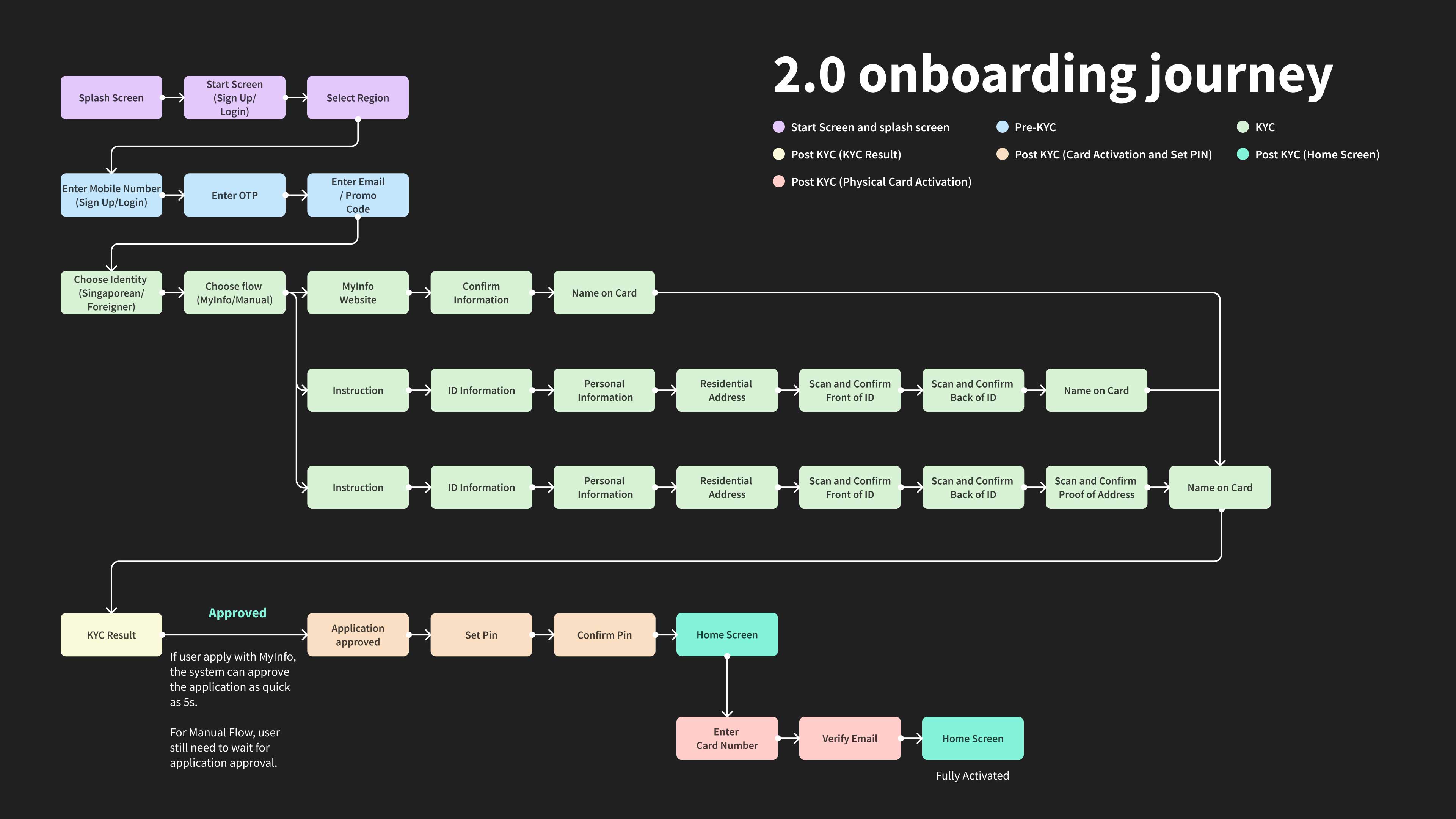
To better identify the problem in each stage of the onboarding. I broke down the onboarding into 4 parts:

Ineffective app introduction - despite we have introduction screens explaining what the app is about, we found most users skip this section and often ask questions related to our core features

Only provide the login with email option after user requested the OTP (Unnecessary SMS Cost and we have received some CS enquiries asking if we have login with email option as they are travelling and couldn't get the OTP)

.png)
.png)

After reviewing all the formation we have gathered, we noticed the existing onboarding process is lengthy and users often drop off during the KYC approval stage while waiting for physical card delivery.
How might we create a Simple, Quick, Delightful and Transparent onboarding experience for the new users to reduce the drop off rate?
With the help of new KYC service provider and virtual card technology, we have the opportunity to drastically shorten the application process and reduce drop off rate.
By understanding the known issues that we have, I started working on the early concept to explore different design directions and get feedback via internal user testing. And eventually get to the final design after few iterations. Below are some key feedbacks I’ve learned along the way:


With the feedback I have received, I went back and tried to brainstorm some new ideas with others.
A new idea came to our mind, Conversational-Like UI to make the onboarding journey more interactive and at the same time way more interesting with human touch.
To make our app more interesting, we introduced Instagram story style videos to explain the benefits of using YouTrip and we've also added a Rate Calculator to show users how good our rate is (10 exchangeable currencies) compare to the major competitors.

The enter promo code is now moved to the enter email page after we verified user's phone number. We found from the previous Thailand Referral Program that the earlier user enters the promo code, the more likely they are going to complete the sign up.

We’ve experimented with few different options and finally decided to adopt Conversational-Like UI to add human touch and speed up the application process. We believe this not only give a refreshing experience to our users but also improve the drop off as we have removed some unnecessary information for user to review.
.jpg)
We’ve also tested the same approach for the manual flow but unfortunately it makes the form filling process much more complicated and difficult. Therefore we decide to introduce the Conversational-Like UI only for the MyInfo Flow.
Therefore, for this part of KYC (~30% of users apply manually), we keep the original form filling design but optimised the micro-interactions to reduce the number of clicks user needed to fill all the information required. (e.g. automatically jump to next field when DOB is filled)
.jpg)
%20Submit%20Document.jpg)
Since the new card card details will be at the back of the card, I’ve added a short animation to spin the card from the front to the back and also gives a preview to our new users of how their new card looks like

By default, we used user's name on card as their user name but we also allow them to customise user name for future user communication. Once it is set, we would show a short animation showing them they can start spending online with the new virtual card.


Here are what to expect 3 months after Launch:
(OTP > Sign Up > Card Activation > Spending > Spend a lot)

.webp)